Final poster Design
- Conor
- May 20, 2019
- 2 min read

Updated: May 25, 2019
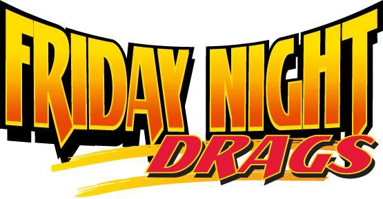
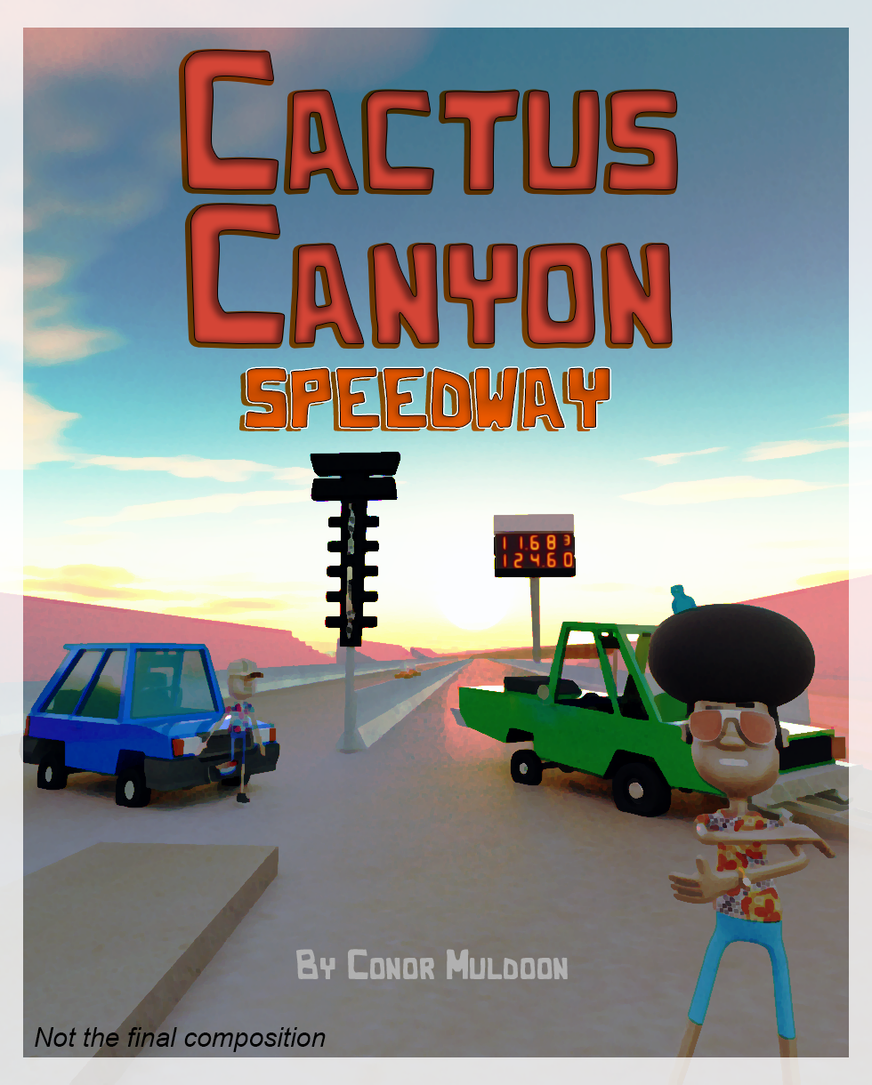
Below can be seen my final poster design, as well as the original mock-up piece. The biggest changes were essentially the typeface. While the original had a softer and western inspired font, I didn't think it reflected the overall hard edged style that my film has. So I set about looking for a blocky modernistic typeface that would complement a racing themed story. My reasoning for choosing Italics was mainly due to Micro-machines, one of my earlier project inspirations that was suggested to me, the only difference being the sharper edges this font has. The idea of having a gradient font was something I had thought of would work well since I was aiming for an overall 80s theme, I took this idea from the 1980s TV series Baywatch, in which a similar gradient to convey the sunny warm setting which it takes place in. The name of the font is 62 Dragz, created by Youssef Habchi - his website can be found here: http://youssef-habchi.com/

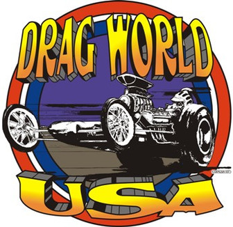
Below you can see the the use of the orange to yellow gradient. The reason for the use of this font I believe is to be more inviting to an audience and sets a bright mood about the sport

This style of font can be seen throughout the drag racing world, for company names, team names, as well as drag racing events.


Another thing to mention is the orientation of the final car on the right has been changed. The reason for this decision was simply to add more depth to the composition. Initially I thought having them pointing in opposite directions would help create this effect but instead it seemed to drag your eye away from the cars and towards the character in the foreground. By changing the cars direction and bringing it closer made the character and cars more noticeable together and at the same time helped the title stand out more as well.


Comments